


Designing for a technology site can come with a lot of trepidation. On one hand, you want to make sure the design really captures the essence of the technology being presented. On the other hand, you don’t want me to be technical, cold or boring. You really have to find the middle ground. You want to be technical yet modern and edgy. The last thing you want to do is to create a design that most web hosting providers use to sell their services. To help you create a unique design, here is a list of some of the best design formats used by various technology sites.
1. Evernote – Animates Images & Lead Generation
Evernote is a note-taking app that’s popular with business people and students. Their web copy is compelling because it gets straight to the point and explains their product in two short sentences. This is followed by a signup link or login option. The backdrop is a simple animated image that’s like a video without the loading issues. If users want to learn more, they can simply scroll down to learn more about the features of the app
If you have a complex software program, this is a great example to model your design on. You can get straight to the point, explain the core benefits, and move forward with the lead generation. The animated image is something anybody can do. It will work very well if you can give an idea of how your program can be used.
2. Apple – Minimalist Yet Sleek Sales Page
For a long time, Apple has used a minimalist approach to its design. However, it’s sexy and sleek minimalism that showcases their product incredibly well—using a long-form sales page that uses large and high-quality images to show various aspects of their product and use feature/benefit copy to explain everything their product does.
Apple also manages to engage users with links that go in-depth about each feature. When users click on the link, the feature list collapses to reveal more information. This works great because the sales page is set up to maintain a specific flow that highlights the best features of the product. Users only learn more about each feature when they want to.
3. Echo – Interactive Design and Scrollable Sales Page
Echo does a fantastic job of showing their app works. The left-hand side of their website describes the product, and the right side is an image of their product in action. The unique part is the fact that you can interact with the image to see how it works. Another excellent design feature is the fact that you can scroll down to different parts of the page. There’s no need to manually adjust to the correct part of the page as it scrolls to the perfectly aligned sections.
If you have an app or even physical product that you’re selling, why not get people to interact with it? Let people see for themselves how your product can be used. This web design agency Birmingham is not hard to pull off and is just a matter of interchanging images when users click on various parts of the first image.
4. Raychem – Parallax Design
Another great (but technical) way to showcase how your product works are through parallax design. This is a design that changes images when users scroll down or up. Raychem uses parallax to walk the user through the features of the product. Many websites use parallax to bring up graphical cues, transitions and evolving images to make the whole browsing experience interactive.
Parallax is not easy to pull off. You’ll probably have to hire a web design company for the job professionally, and it won’t be cheap to hire a web design Toronto company for the job professionally, and it won’t be cheap. In addition, it might not be ideal if many of your visitors are mobile users. The image-rich design format may create loading issues on many mobile phones. This is a design format that you may want to explore if you want maximum engagement and a unique presentation.
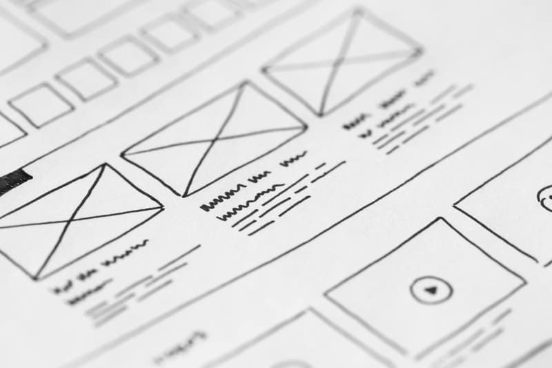
5. Pics.io – Sketch Design with Video
You can’t go wrong with using video presentations to explain software solutions. Pics.io is a workflow platform that explains their product using a video done in sketch. The result is a presentation that has personality, is easy to understand, and is straight to the point. The cartoon-like sketch presentation doesn’t take away from the credibility and idea of the product. In fact, it actually makes it more reliable.
This shows that you don’t need a technology-centric design for technology products. Using things like a flat, sketch, and minimalist design can often work better. You must remember that the point is to make users understand what your product or service does and how it benefits them.
As you can see, there are many design formats you can use for your technology site. You don’t have to go with boring boxy, feature list-driven, web hosting – type sites. Think about which design format would best highlight your product or service. If you need more ideas, look for websites of products/services that are similar to yours to see how they’ve done it. It might offer a helpful perspective that you may have been missing.